
Commercial Vehicle Wrap Design Mistakes and How to Review Them
A useful commercial design makes the operator recognizable, gives the viewer relevant context and supports a clear next action. Review the actual vehicle and message before approving a layout that looks impressive only as a small image on a screen.
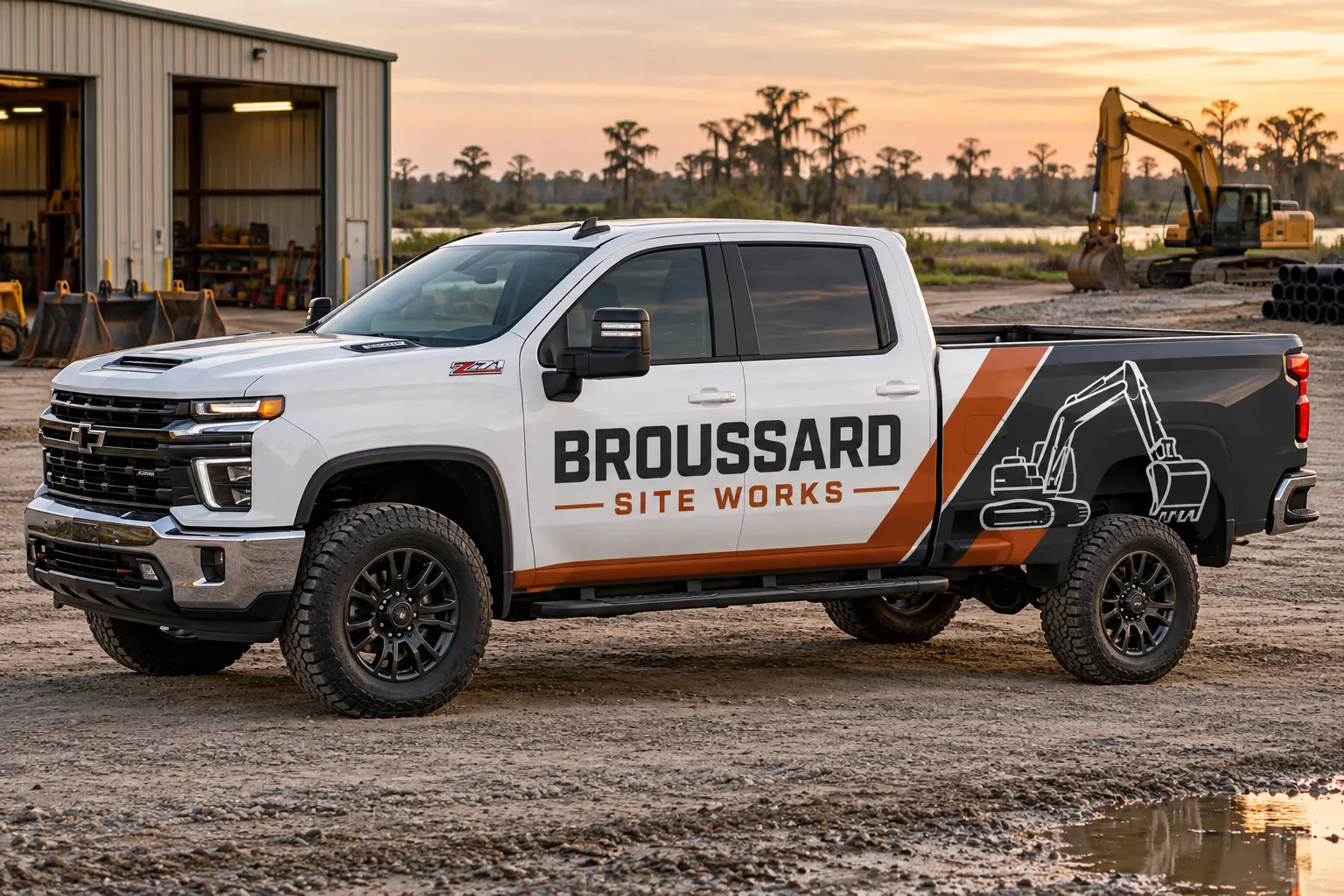
Fictional commercial wrap design concept; not a completed customer installation.
Mistake 1: asking every message to be the main message
A company name, several services, multiple contact routes, partner logos and a promotional line cannot all lead the same composition. Decide what the viewer should recognize first and which information supports it. A design review becomes more useful when the business ranks the message instead of simply asking the designer to make every element larger.
Write a short hierarchy before the layout begins: operator identity, service context where needed and the primary contact route. Keep secondary detail subordinate and check factual wording with the responsible contact. More coverage does not automatically solve competing priorities. A broad panel can still feel crowded if every line has the same visual importance and the business has not decided what the vehicle is meant to communicate.
Mistake 2: treating a vehicle as an empty rectangle
Doors, handles, body seams, windows, compartments and equipment interrupt the available surface. A layout can look balanced on a generic rectangle while placing a company name across a latch or a contact detail in a recess. Collect the actual configuration before deciding where the important content belongs.
Use the survey guide to connect overall views with measurements and details. Review both sides and the rear independently. Do not assume that a layout approved for one body fits another model, longer wheelbase or aftermarket service body. A real fitted design should preserve the message while respecting the equipment rather than expect the hardware to behave like a blank poster.
Mistake 3: shrinking important information to preserve decoration
A large pattern, photograph or decorative illustration can support the identity, but it should not force the company name or contact action into an unreadable corner. Review the composition at the actual proposed scale and intended viewing positions rather than only as a polished thumbnail. Ask what remains understandable when the viewer has limited attention.
Avoid unsupported claims about guaranteed reading distance or speed. The practical review uses the actual layout, size and context. Remove or simplify secondary decoration when it competes with the commercial message. A business can still have a distinctive visual identity without filling every available panel or presenting a detailed image that overwhelms the reason someone should recognize and contact the operator.
A short proof review before acceptance
| Check | Question |
|---|---|
| Hierarchy | What should the viewer recognize first? |
| Fit | Does the layout use the actual vehicle configuration? |
| Contact | Are the number, domain and destinations current? |
| Data | Has the unit register been checked separately? |
| Version | Which accepted file controls production? |
Mistake 4: approving the contact route without testing it
Check the spelling of the business name, domain, phone number and any supplied code destination separately from the visual layout. The responsible business contact should verify the actual route and what a visitor finds there. A visually correct file can still reproduce an old number or send a customer to an outdated campaign page.
If a QR code is included, define a useful reason to use it and test the supplied code in the proposed output review. Keep the main business identity understandable independently of the code. A good graphic cannot compensate for a broken contact destination, and a successful screen scan alone should not be treated as proof that every real viewing condition has been assessed.
Mistake 5: ignoring body color and production references
Uncovered paint is part of lettering and partial-wrap layouts. Record the actual colors across the fleet and review relevant combinations instead of assuming a design accepted on a white vehicle has the same appearance on every replacement. The selected material and finish also belong in the retained visual standard.
Use color consistency planning to distinguish source identity, output reference and current installed condition. Do not approve a precise physical color expectation from an unrelated screenshot alone. If a different finish or construction is proposed, review it deliberately rather than call it an exact repeat merely because the logo file is the same.
Mistake 6: approving through conflicting file versions
Several people can give useful feedback, but the project needs one consolidated decision against a clearly identified version. Record the configuration, coverage and unit list covered by that approval. A filename labeled final is not sufficient when several files with that name contain different words or placement.
Check variable unit data separately from the visual identity and have the responsible owner verify it. Keep required operational markings and clear areas within the appropriate fleet review. The design standards guide explains how the accepted source and configuration records fit together. Do not let unresolved comments become instructions the installer must interpret at the vehicle.
Mistake 7: losing the standard after the first installation
Retain the accepted artwork, material references, finished configuration and installed photographs. Record later repairs, equipment changes and business wording updates. A repeat order should start from the current accepted system and actual asset condition rather than an old promotional photo or whatever production file happens to be easiest to find.
Use fleet graphics management for continuing additions and repair enquiries. For a new layout, send the commercial design brief with current files, vehicle photographs and message priorities. The strongest review process catches these mistakes before manufacture and leaves the next order a defined starting point rather than another reconstruction exercise.
Frequently Asked Questions
Turn Your Vehicle Details Into a Clear Project Brief
Send current photographs, vehicle quantities, logo files, coverage preferences and timing. Identify old graphics and paint concerns so the project review can address the actual equipment.
Explore planning resources or request your commercial wrap quote.